Saturday 29 November 2014

Work Dairy - Walk 2

Evaluation

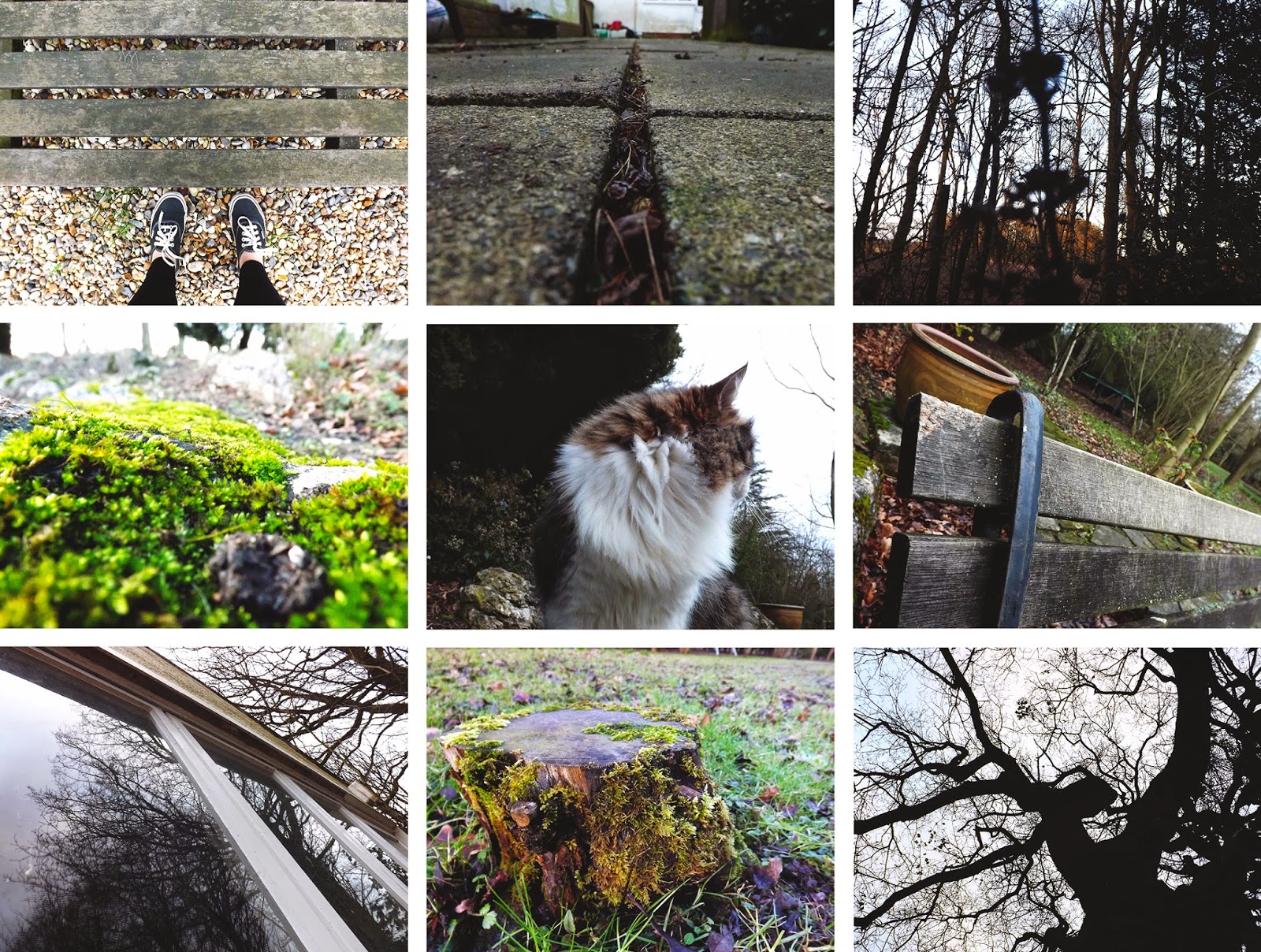
I really enjoyed walk two as I was not limited to the college grounds and could take a large variation of images. I also liked how there were 3 things to shoot; sense of journey, autumn colours and back of heads, as this enabled me to have more to look for rather than one specific formal element. There were many opportunities to take autumnal images as we walked through many paths surrounded by trees and also passed some forest, so the majority of my images were of autumn colours. The walk gave the opportunity to also take better back of head images as there was a larger variation of backgrounds I could have used, for example a lake or a road. This resulted in some interesting images. I enjoyed taking sense of journey images and found that these were not difficult to take in this area, as I walked past roads, paths, benches and bus stops. I liked editing the images I had taken and tried to adjust the colour in order to bing out the autumn tones like oranges and reds, and this really benefitted some of my images and made it more apparent that they were autumn images.

There were not many negatives to this walk, however if I have to point one out I'd say that most of my autumn colours images looked the same, as I motly took pictures of trees and leaves for this, however I still ended up with very varied back of head and sense of journey images.


I really like this image i had taken during walk 2, as the background had slightly blurred while the back of the head is focused. I made sure the back of head was not central so that the scenery could be focused on. I really like the reflection and highlights in the lake, and also the lines in the photo, in the form of the bench and the outline of the river. This is different to my other back of head images, as the background contains a lot of content, whereas my other back of head photos have had a relatively plain background like a wall or a bush.


This picture would have been better if the camera had focused on the berries rather than the leaves around it, as their colour stands out against the leaves. Despite this, I like how the berries are not central so that we are able to see the different colours of the leaves in the background. I like how the red colour contrasts against the green colour in the leaves. 

Progression

If I were to go on another walk taking back of head, autum colours, and sense of journey images, I would want to explore a range of different areas for some really varied images, especially for sense of journey. I would try to take a larger variety of images for autumn colours as I struggled to think of different ideas for this and so ended up with a lot of similar images.

The picture below is an example of journey photography, and I would quite like to take photos similar to this. Most of my journey photography did not actually include people, as I just took pictures of objects which implied a journey such as sign posts and pathways. After looking at this image I think I could have created better journey images if I included people in them as this makes the journey aspect clearer, and the fact that they are walking away from the camera also does this. The tunnel is effective as we do not know what is on the other side, or where this person is heading. In this picture, a sense of mystery is also created as we cannot see the persons face but I like that about it. This image has inspired my to take more sense of journey imagery but including people, as this works more effectively.

Work Diary - Mapplethorpe Location

Evaluation

I found it quite difficult to take pictures in the style of Mapplethorpe. To start off with I began just taking any portraits, and not thinking about Mapplethorpe's work as I did them. These images were not focused enough on the face but more on the background, which isnt what Mapplethorpe's portraits are like. There was too much empty space in the frame and the face was not shown close up enough. I also found it hard to come up with many different composition ideas, as Mapplethorpe's own are quite unique.

On the other hand, I did end up taking some reasonable images when I went out a second time to shoot.I thought about Mapplethorpe's work and the kind of compositions used in his photography. I made sure the second lot of pictures I took were very focused on the face, with no empty space in the frame. When it came to editing the photos I tried to make some of them look similar to Mapplethope's, and experimented with black and white. This benefitted the result of some of the images as the tones, highlighted and shadows in the face were more emphasised, like in Mapplethorpe's work, but I thought some of them looked better in colour. I am very happy with the straight images from this session and think that some of them are some of my best shots overall.


This was one of the first pictures i had taken. I quite like the picture itself but it does not look Mapplethorpe inspired. There is far too much empty space in the frame and the face is not shown close up enough. Because of this the tones and details in the face are not clear, and my focus lies on the contrast between the two colours of the wall, rather than the facial features. 


This picture looks more Mapplethorpe inspired as it is focused on the face rather than the background. Comparing it to the top picture, there is a lot less empty space in the frame and there facial features can be seen a lot clearer. I am happy with the outcome of this image and think that it does look inspired by Mapplethorpe's portrait composition.


Progression

If I was to go out and shoot Mapplethorpe location again I would probably experiment with a larger variety of unique and abstract compositions, as this is what Mapplethorpe did. I would also try out different props as Mapplethorpe did this in some of his portraits, but also to make a more interesting, creative image.

The picture below is one of Mapplethorpe's photographs. He uses props like this in a lot of his work which adds interest to the image, while also filling the frame. After looking at this I feel that I could have improved my Mapplethorpe photos using props like this, as they can completely change the image but also create an interesting composition and add interest to a plain image.

Thursday 27 November 2014

Image Bank - Multiple Imagery


Multiple imagery are when separate images of the same size are put next to each other to create a unique collage. They do not all have to consist of 9 images, and i have seen some with a lot more which are quite abstract and effective. I have seen a range of different approaches to a multiple image, for example some I have seen consist of different photos from different angles, but of the same object like in clock image, yet other multiple images contain photos of different objects or scenes like the third image down. This is different from anything I have looked at in photography before, and I quite like the idea as it comes across quite effective.

The Formal Elements

- Line
- Shape
- Form
- Tone
- Texture
- Pattern
- Colour
- Movement
- Depth
- Reflection
- Contrast

Straight Images - Mapplethorpe Location


Image Bank - Mapplethorpe Portraits


I realised after looking at some of Mapplethorpe's work that very many of his portraits are black and white, and are taken with simple, plain backgrounds. Although this seems very simple, the black and white effect allow the different tones to be clearly shown in the faces, which creates form. Despite this, some of his portraits like the bottom image include blurring, or props to make them more unique and abstract, which I quite like about his photography. Mapplethorpe focusses a lot on composition, and he explores many different ones in his portraiture.

Tuesday 18 November 2014

Connecting Essay 2


This is an image I had found. The camera is positioned behind the bench so that the view from it can be seen. It has been taken as a landscape long shot also so that the scenery in the background is visible. This also emphasises the size of the area. The scenery is very natural, and we cannot see anything other than trees in the surroundings, making this area seem isolates, creating a sense of loneliness as the person is alone. I like how we cannot see the face of the person on the bench as it creates a sense of mystery, because the face is the part of a person that is usually focused on in photography. The fact the face isn't shown allows us to focus more on the scenery rather than the person. We unable to see any details of the person as they are shown as a silhouette, which is quite effective and again helps create a sense of mystery. The photo has been edited black and white, which makes the tree trunks create significant silhouettes against the plain white sky. Lines are also shown in the bench as the dark planks of wood are contrasting as the light comes between them.The thing I like most about this image is that it creates a sense of journey and adventure.


This is an image I had taken during walk 2. It is taken from behind the bench so that we are able to see the view from it. We cannot see the person's face which creates a sense of mystery, as the facial features are usually focused on in portraits. The person on the bench is not central in the frame, which allows to see the natural surroundings in front of the person. The landscape format also allows us to see more of the surroundings, so the time of year is emphasised Lines separate the water from the grass and bushes, and can also be seen in the bench. Autumn colours like oranges, yellows and greens are visible, and I increased the saturation of them in order to make them more vivid and reinforce the idea that this is an autumn scene. The texture of the girls hair is visible due to highlights and shadows, creating form. Texture is also visible in the lake as ripples are created and shown due to highlights. A blurred reflection is created in the lake which is quite effective. Overall the images creates a sense of journey, and clearly establishes an autumn theme. 

The content of these two images is quite similar, showing the view from a bench. Both of these images include a person who's face is not visible. This is so that the details of the surrounding nature is focused on rather than the features of the peoples faces, but also creates a sense of mystery. The images are also both taken as a landscape in order to fit the nature into the frame. Both pictures show lines in different aspects of the images, but they also both create a calm peaceful, and quiet atmosphere due to the appealing views, and the fact the person is alone in each image. In both cases, the person only takes up a small part of the frame, which allows us to focus more on the natural surroundings and get a feeling of autumn.
 
Differences between these two images includes colour. The image I had found has been edited black and white which works effectively as it emphasises contrast and keeps the image simple, reinforcing the feeling of calm and peace. On the other hand, I decided to alter the hue of my image in order to emphasise the autumn tones like reds and oranges. This worked well to establish this as an autumn photograph.

Connecting Essay 1

This is a photo I had found. The first thing I noticed about this image was the visible lines which are in the form of tree trunks. These lines allow us to see the depth and hight of the trees. The photo is taken as a high angle shot in order to show the full trees. I like how it is taken from this angle as it allows us to focus on the different tones and colours of the tree leaves. The colour in the photo is very emphasised. There are very autumnal colours shown such as orange and yellow. These colours are very vibrant and  bright which allows us to see the different tones in the leaves. There is clear contrast between the dark tree trunks and the light sky.


This is an image I had taken during walk 2. I had taken it as portrait rather than landscape in order to emphasise the height of the trees. I also angled the camera upwards for the same reason but also to show depth. I adjusted the hue and saturation of the image in order to enhance and emphasise the colours, and to make it more obvious that this is autumn photography. There is contrast between the green tree trunks and the white sky.


both images are similar in the way that they both include trees of a similar structure. The height of the trees in each image are emphasised, but in different ways. In the top image, the angle of the camera emphasises the height of the trees, and in my image the way the image has been taken portrait rather than landscape shows more of the height of the trees and therefore emphasises the height. The colours in both images are quite vivid so that the time of year can be easily identified.

Straight Images - Walk 2