Thursday, 23 October 2014

Work Diary - Back of head (Studio)

Evaluation

I enjoyed the back of head studio shoot as the quality of the image was a lot better than the location shoot. This was because of the studio lighting which really brought out the different tones in each persons hair. I also preferred the studio shoot to the location shoot because I could shoot against plain coloured background which makes the image focus on the persons head, whereas with the location shoot the background sometimes distracted attention from the main point of the photo. I quite liked using the prop of a feather scarf as this made the images more unique, as it stood out against the plain background.

Something which I found was difficult about this shoot, is that it was hard to get very varied images and there was not many different compositions that could be created in the studio. Because of this many of my images looked very similar, but just with different coloured backgrounds. To overcome this I could have used more than one persons head in an image so that a larger variation of compositions could have been created.


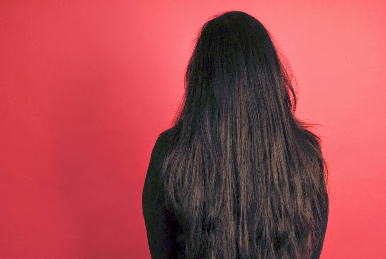
I really like this picture I had taken during the back of head studio session. I like how the jacket and the background are the same colour, so that the bright pink scarf is really contrasting and vibrant. The highlights and shadows in the jacket create visual form and texture. I edited the colours in order to make the feather scarf stand out even more, so that this image shows contrast as well as back of head. The prop causers the image to be quite unusual and abstract which I really like about it. 


Because Vandana has very dark hair, it is hard to see the back of her head against the black background. The pink scarf is the only thing that can really be seen in the picture which defeats the purpose of the shoot. If I was to shoot this image again I would shoot against a different colour background so that the back of head could be seen a lot more clearly.

Progression

If I was to shoot back of head portraiture in the studio again i would experiment with different angles, as in this shoot I shot every picture from the same angle. I would also experiment with different compositions by using more than one head in each picture, which would also make the images more interesting, and take up some of the space in the frame. I would use appropriate backgrounds depending on the colour of the persons hair, as in this shoot it is hard to see the persons head against the background. I feel that the use of props really benefitted my work so I would experiment with more of these if I was to do this shoot again.

This picture below has given me quite a lot of inspiration for back of head photography. With mine, I have only been focussing on the actual head, and been close ups of it, however this image showed me that you can still have a goo back of head image but with more in the frame, like various props. This is a lot more interesting than a simple image of a head, and has a lot more meaning. In this picture the head only takes up a small amount of the frame, but this allows us to see more details in the frame like the guitar which I think really makes the image. After looking at this picture I really want to try and take similar back of head images like this, that include props and more content in the frame rather than just the head.

Best 20 Pictures


Straight Images - Back Of Head (Studio)


Work Diary - Studio Form

Evaluation

This was the first time I had shot in the studio and I enjoyed this session. Because of the studio lighting, the highlights and shadows in each picture allowed form to be shown very clearly, and also texture. I liked shooting against plain backgrounds as it made shape more visible, and also did not distract attention away from the main aspect of the image. The plain backgrounds also sometimes contrasted against the content of the image. I am happy with the outcome of this shoot and really like some of the images produced from this session.

A problem I had with shooting form in the studio was that sometimes I found it tricky using the studio camera which i had not used before. The zoom and focus was different to the cameras I had previously used so it took a while to get used to this. Another problem with this session was that It was difficult to get very varied images. All of my pictures were of either faces or clothing, so most of them turned out quite similar.


This picture I had taken during the session shows form very clearly as the highlights and shadows in the jacket contrast against each other. Texture is also very clearly shown which i like about the image. I think that the fact the image only shows clothing, and not a face benefits the picture, however I think that the picture would be even better if I had zoomed in further into the jacket so that the form could have been focused on even more. This would also get rid of the empty space in the frame.


After taking portraits from the front, I wanted to try out different angles in order to create more varied images. I decided to take some portraits from the side, and I liked the result of this angle. Different tones are shown very clearly as highlights are visible at the front of the face, while at the side of the face it is a lot darker so that form is clearly shown. Shape is also visible, as the studio lighting allows the outline of the face to contrast against the dull background.


Progression

If I was to do this shoot again, I would try to shoot more than just faces and clothes. I could bring props into the studio and shoot their form with the studio lighting. I would also try to experiment with more angles as more of my images ended up very similar in this shoot, and there was a lack of images overall. I could include more than one person in the frame to make the images more interesting and so that more form is shown. I could also edit the images in order to make the form the more noticeable part of the image, so for example editing the images black and white so that focus is not on the colour, but more on the tones. 
 
This image below is an example of the type of studio form photography I would like to take. It shows the clear form of an object rather than a person, which I think is more effective. It has also been edited black and white which is a good idea as the tones, shadows and highlights can be seen more clearly. The shadow below it also helps emphasise the form, which us another reason objects would be better for form photography. The way the can is misshaped emphasises the form as there are more shadows and highlights. This image has inspired me to practise more object photography in the studio as I haven't had much practice with this.
 

Alexandre Moreau

Alexandre Moreau is a professional wedding photographer in London shooting locally and abroad for destination weddings, however he also does other photography such as abstract and travel. I have chosen to look at Alexandre Moreau in more detail because I especially like the uniqueness of his abstract and travel photography, and the colours used. 


The first thing I noticed about this image is the colour. A range of  bright, vivid colours are clearly visible in the background of this image which is something I really like it. These colours create a sense of positivity. We can see a very clear, dark sillouette of what appears to be a young boy. Because of the significant contrast between the dark silhouette and the bright colours in the background, the outline of the boy can be seen very clearly so therefore shape is shown. The boy only takes up a small amount of the frame but he is the main focus of the image, as his shape is clear and sharp unlike the other silhouettes which are further away from the lens and slightly blurry. The coloured background is blurred which allows depth to be shown and black lines in the background contrast against the bright colours. The fact that we cannot clearly see any features of the boy creates a sense of mystery.


Contrast and shape are elements which comes across very clearly in this image. The black silhouette of the statue and pillars contrasts significantly against the vivid orange sky. This allows the outlines to be very visible so that shape is clearly seen. The pillars create lines in the image, and as they are aligned, depth is shown, because the pillars get smaller the further away from the lens they are. Although there is not much going on in the image It is quite effective in this situation.


This photo is from Alexandre's wedding work. The first thing that stands out is the colour. The petals are of quite vivid colours, and contrast is apparent as two of the bowls of petals are red, but the petals in the middle are white and pink. As well as contrasting against the red petals, the pink and white also contrasts against each other. The background is very out of focus which allows depth to be shown. The wooden bowls of petals also contrast against this background as it is mainly white and plain. The form of the bowls is shown by the dark shadows underneath them.


This image consists of mostly dark tones. I find this image very unique as is it taken at an unusual angle. Lines are visible in the form of the metal railings and the steps. The metal reflects the light creating bright highlights, and depth is shown as we can see the steps further away from the frame are smaller and less focused. The escalators add a sense of journey to the photo.

After looking at the photography of Alexandre Moreau I want to experiment more with showing depth in my photography, as I like the look of this in images and think that this is very effective. To do this I could experiment with different camera settings in order to create a blurred background. 

Moreau's work has influenced me, as I have been more experimental with bluring in my photos in order to show depth and have created some good images. I have also tried out different hues and saturations in order to control the overall feel of the images, the way he does.

A while after first discovering Alexandre Moreau's photography, I still enjoy the unicity of most of his work, however I find his wedding photography, which is what he focuses on the most, lacking interest as I prefer unique, abstract, and creative photography.

Wednesday, 22 October 2014

Work Diary - Back of head (location)

Evaluation

I really enjoyed the back of head location shoot. I found it was different to photographing the formal elements like I had previously done, as it enabled me to be more creative. It was enjoyable looking for interesting backgrounds to shoot the back of head in front of, and after shooting in front of obvious background like walls, I tried looking for more interesting backgrounds. I also began taking pictures with two heads in the frame and took them from different angles instead of shooting just one head from straight on. This enabled me to create a larger variation of compositions, as I have more in the frame. I was also able to experiment with a different setting on the camera as an aim of the task was to make the background of the photo blurred, but the head focussed. At first this did not work well however the more I tried, the more effective the images looked. This blurring allowed the images to show depth, as well as back of heads. 

Something tricky about this task was that It was hard to get very varied pictures. It was hard to think of many compositions that you could create using just the back of the head, so a lot of my images ended up similar. Despite this I tried to overcome this by including more than one head and using a variety of different camera angles. I tried to find more interesting and unusual backgrounds to shoot against to also overcome this. 


I like this picture i had taken during the back of head location session. I like how there are two heads in the frame rather than one, and this shows depth as the head nearest the camera is clearer than the one further away. I also like the background of the photo, and how it is not just plain and shows some of the surroundings. I realised that this camera showed contrast quite well, as both people are wearing dark clothes and have dark/dull hair which really contrasts against the vivid colours of the nature in front of them.


This was the first image i had taken during the session. The background has blurred very well so that depth is clearly shown in the image. The back of the head is very focused so that the different tones in the hair are visible, and the texture of it. the dark hair contrasts against the vivid colours of the nature in the background which I think improves the image. Despite these positive aspects, I feel that this image would have been a lot better if it was not as zoomed, so that the whole lengths of hair could have been visible. I also think there is a bit too much space in the frame, as the focus is supposed to be on the back of head rather than the background.

Progression

If I was to go out and shoot back of head location pictures again i would try even more different angles in order to get a larger variety of images, and use more heads in order to create lots of different compositions. I would also use a larger variation of backgrounds to avoid images being very similar. If I found a good background, I could take lots of images of the heads in front of it but from a range of different angles, so that I had a larger chance of taking a good image.

The image below is an example of the kind of back of head photography I would like to achieve in the future. It is quite different from the shots I had taken. Mine had been very focused on the back of the head, rather than the surroundings or other content in the frame. In this photo the head only takes up a small part of the frame, so that the position of the person and the surroundings are visible. This has inspired me to focus a bit more on the other content in the frame rather than just the head, because although the back of head is the main focus, the surroundings or position of the person can completely change the feel of the image and add a lot of interest to it.


Monday, 20 October 2014

Straight images - back of head portraiture


Image bank - back of head portrait


The eyes of a person are usually the first thing you notice about them, and are usually in the middle of the picture, however in this situation the eyes are not shown which makes this an abstract and unique approach to a project.

Thursday, 16 October 2014

Defining Portraiture

Dictionary definition: 

Portraiture: the art of painting or taking portraits.
Portrait: a painting, drawing, photograph, or engraving of a person, especially one depicting only the face or head and shoulders.


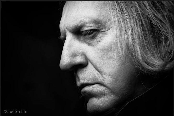
In this photo, a black and white effect is used so that the tones in the face are more visible. Because of these different tones being showed, the for of the face is more obvious which makes that facial features clearer. The background is also blurred and plain so that the focus is on the face. 


This photo is in colour however the tones in the face can still be seen due to the highlights and shadows which emphasises the form. the background is plain black to that the focus is on the face. 


Portraits can be taken from different angles and this one is a side view of the face. It is in colour so however the facial features are sill visible due to lighting. The background is plain and blurred while the face is very focussed to that the man is the focus of the image. 


Instead of a black and white effect, other colours can be used because we can still clearly see the different tones in this colour. This is not black and white but navy which makes it more unique. The picture is also taken very close up so that the features can be clearly seen. 

My own definition of portraiture: The art of painting, drawing, or taking a picture of the face of a person. 

Image Bank - Potraiture


These six images are all portraits. After looking at portrait photography I realised that most of it is in black and white. This is so that the tones in the face are visible in order to show form. Portrait photography is also often taken very close up so that the features of the face are clear and detailed. Complex backgrounds tend to distract attention away from the main aspect of the photo, the face, so most portrait background are very subtle or blurred out. In some portraits like the photo at the bottom, one specific feature is focused on. The mans face is black and white however his eyes are still coloured, so this is what we focussed on.

Work Diary - Shape

Evaluation

I had a lot of time to photograph shape which resulted in a lot of images taken. At first I did not have much idea of what to photograph, however as time went by I was able to spot more shape around me and examples of shape that weren't so obvious. I tried to use a camera angle which would emphasise the outline of the object, and one idea I had was to position the camera so that the background of the photo was the sky. This made the object form a silhouette which from my research I know is common in shape photography. The dark silhouette contrasted against the light sky in oder to show up the shape very clearly. Another reason I tried to get plain backgrounds in the frame was so that the focus of the image was on the shape and not the content in the background. Sometimes in order to do this I had to move objects around so that they were against a plain background, which made the shape a lot clearer than it would have been if I had photographed it against a complicated background with a lot in the frame. 

One slight problem I had during the shape session was lighting. It was very dull outside which meant that the contrast between the shape of the object and the background was harder to see, which made the shape less obvious. Despite this the sun did come out a few times which enabled me to take some good shape images. 


I really like this image I had taken in the shape session. I had angled the camera to point upwards so that the background of the image was the sky. This caused a clear contrast between  the building dark and the light plain sky, causing a silhouette and a clear outline of the shape. This image also shows lines in the form of the side of the building and the metal pipes. I really like this image and think that that it shows shape very well.


Although this image shows clear bright shapes as the vivid colours contrast a lot against the white background. I do not think it is a good image because of the lighting I had taken it inside so there was no sun, which decreased the quality of the photo. I also think that the coloured people should take up a lot more space in the frame, so that the focus is on the shape and less on the background. The image clearly shows colour, so to make the image focus more on the shape than the colours I could edit the image black and white. This will still clearly show shape in the picture.

Proggression

If I was to go out and take pictures of shape again, I would do it on a bright day so that the shape in the images would be a lot clearer and I would have produced some better quality images. The dull lighting really affected my images and I think they could have all been a lot better if i had taken them in the sun.

This image below is a good example of shape photography. this is the kind of lighting I would have liked when shooting shape, as it really enhances the image. This image works because of the brightness, however if it was a dull day it would not have been as effective because the hands wouldn't contrast enough with the sky, but in this case because the sky is bright blue so the contrast is clear.

Straight Images - Shape


Monday, 13 October 2014

Studio Form


Mid-Project Evaluation

Overall I have enjoyed studying photography so far as I have learn a lot about the different formal elements and key photography skills, such as the different camera angles.

One of the things I have enjoyed the most so far is the practical work. I found it enjoyable going out and taking pictures of the formal elements. With this, I liked how I could be as creative as I wanted to, for example sometimes I created my own picture by moving objects about in order for it to relate to the theme of one of the formal elements. I could also be as creative as I wanted to with the editing, and activities like the computer experiments and print techniques especially allowed me to do this. Another thing I could be creative with is the physical experiments which I really enjoyed doing. Something else that I enjoyed during photography so far is experimenting with photoshop. Before starting the college I did not know how to use this, and I have learnt a lot about it during photography. 

Something I haven't enjoyed so much is the amount of work. Although I try to keep on task I find it hard to keep up with the written work sometimes. A mistake I have made during the project is leaving some of the work until the last minute.


Jay Maisel

I chose to look at Jay Maisel's photography because he doesn't just look at one area of photography, like most of the other photographers I researched did. This means that there is a larger variation and there is something for everyone to like. I also like how it is abstract and unusual, as this shows creativity. 

Jay Maisel began his career in photography in 1954. He spent over 40 years shooting annual reports, magazine covers, jazz albums, advertising and more for an array of clients worldwide. Since he stopped taking on commercial work in the late ’90s, Jay has continued to focus on his personal work.


I like the colours used in this photo. I like how the bright lights from the building windows contrast against the dull brown sky. The outline of the building can be clearly seen as they contrast agains the grey fog to create silhouettes so that shape is show. I also like how the image focusses on the nearest buildings so that you can see through the windows, whereas the further buildings begin to fade away. This allows depth to be visible and emphasises the size of the area. I like the camera angle used in this photo as it allows us to see the small buildings at the front as well as the tall buildings at the back, which is another form of contrast. I like the background in this image as where the buildings meet the sky it is quite light and mostly, but it gets darker the further up it goes. The top two corners are particularly shadowy which i find is quite effective.


Although this image is simple it is very effective. There is a high contrast between the dark silhouettes of the people and the light and plain wall. Because of this contrast the outline of the people can be seen very clearly so that shape is clear. Although Lines are visible in the wall in the background, and also texture is shown. 


This image is also very simple, however I really like the colours used, and the contrast between the confetti and the plain sky. Also, I find it interesting how the quality of the image is not effected by movement.  


I really like how abstract this picture is. It is not something commonly photographed, and is something put together by the photographer which shows creativity. I also like the combination of colour and the contrast between the silhouette and the colourful lights. 

After looking at Jay Maisel's photography I feel like I want to experiment with abstract photography and contrast, as I find it really adds interest to the image. 

Jay Maisel has influenced me to try out more abstract photography, and also to take pictures with a lot less going on in the frame, or so that the object in the photo only takes up a small part of the frame, as I noticed he does this in some of his work like the picture of the men standing in front of the wall.

After first discovering Maisel's work, I still enjoy it and admire it. The more of his work I have seen, the more I realise how different his pictures are. I like this because he takes pictures of a large variety of different things and doesn't stick to one theme.